Design a Banner for web site
- Status: Closed
- Prêmio: $50
- Inscrições Recebidas: 37
- Vencedor: jamshaidrazaCG

Síntese do concurso
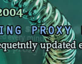
I need GIF banner (about 670x132 pixels) for this web site:
http://screencast.com/t/vyqJCreL1ZtS
The banner will be displayed on this web site:
http://screencast.com/t/SomMSsYI
Information which may help you:
1) Service's advantages: fast pr***, 15000 pr*** per day, updated every minute, lowest price, ideal for SEO
2) The banner advertize paid service, so you may use that in ads logic (display price, discount)
3) There are no preferences for banner's color or style, simply - it should attract user attention
4) With all purchase, user also get Firefox addon for free (the name is written on original banner)
5) Here is the original (ugly) banner: http://screencast.com/t/1rYkbeG3ttf
p.s. I do not mention web site's addresses intentionally. Please do not write them in comments otherwise I will automatically decline your bid.
Habilidades Recomendadas
Feedback do Empregador
“You need banner that sells? Then you must hire this guy, his banners are dedicated to one idea without fake decorations which usually distracts user\'s attention. Good work!”
![]() HIF277767, Thailand.
HIF277767, Thailand.
Painel de Comentários
-

Proprietário do Concurso - 10 anos atrás
#44 For some strange reason I cannot select you as a winner. Please accept hourly based project which I created for you.
- 10 anos atrás
-

saimarehan
- 10 anos atrás
ch see #43
- 10 anos atrás
-
saimarehan
- 10 anos atrás
- 10 anos atrás
-
saimarehan
- 10 anos atrás
- 10 anos atrás
-
saimarehan
- 10 anos atrás
Ch now see banner #38
thanks- 10 anos atrás
-
Proprietário do Concurso - 10 anos atrás
#35 I like the way you decorate Firefox addon in that banner. The arrow in right side is too much. At the same time I like you write FAST in #29 banner. So may be you ca somehow combine those two banners?
#36 OK, I will help you a little bit with slogans. Let's try to update right part with: 'Crawl Web Pages', 'Do Social Ads', 'Post Ads on Board'. In the left part we will have 'We providing service since 2004'. The central part could be updated with 'Download text file with up to 15000 working proxys'. Finally the last sentence could be changed with 'Only recently checked proxy list'.
Do not forget to use orange color instead of yellow. The yellow is hard to read, especially word 'Minute'.- 10 anos atrás
-

Artimization
- 10 anos atrás
Okay. Will be providing you shortly..
- 10 anos atrás
-
Proprietário do Concurso - 10 anos atrás
#32 All banners were rejected because text has no meaning at all! What does 'Creating account' means? What does 'Best protocol' means? Do you know what is protocol? I guess no - then why do you use term which you do not understand?
#28 , #30 too dark, #31 is your the best but it is definitely not worth the budget. For lower price I would select it as a winner for sure.
#27 You are the winner, no need to update anything. I will wait and give last chance to others to provide something valuable so I can select it as a second winner.- 10 anos atrás
-

jamshaidrazaCG
- 10 anos atrás
Thank you sir....
- 10 anos atrás
-
saimarehan
- 10 anos atrás
ch see #35
- 10 anos atrás
-
saimarehan
- 10 anos atrás
see #34
- 10 anos atrás
-
saimarehan
- 10 anos atrás
- 10 anos atrás
-
saimarehan
- 10 anos atrás
ch see # 33
- 10 anos atrás
-
Proprietário do Concurso - 10 anos atrás
#25 You are very close, do not change color! Try to improve slogans and I will select you as a second winner. Think creatively, there should be other slogans:
SLOGAN IDEAS: 'high speed', 'best price', 'frequently updated'/'lists updated every minute', 'good for crawling, posting, creating accounts', 'download pr*** list as text file', 'provide service since 2004', '30% discount'- 10 anos atrás
-
Artimization
- 10 anos atrás
Ok, kindly check the PM so that i can provide you better result.
Awaiting for your reply- 10 anos atrás
-
saimarehan
- 10 anos atrás
ch give me chance also maybe i can do
- 10 anos atrás
-
saimarehan
- 10 anos atrás
and my design #31
- 10 anos atrás
-
saimarehan
- 10 anos atrás
and ch see #30
- 10 anos atrás
-
saimarehan
- 10 anos atrás
and #29
- 10 anos atrás
-
saimarehan
- 10 anos atrás
ch please chk #28
thanks- 10 anos atrás
-
Proprietário do Concurso - 10 anos atrás
#26 We almost completed this banner. Can you make one version with 15000 yellow color and the rest text blue one (I prefer to keep version with 15000 written in bigger font and shadow).
- 10 anos atrás
-
Proprietário do Concurso - 10 anos atrás
#25 Your score is only 3.5 Why did you steal labels from #20 ? It was his idea to use '15000', cannot you think something for yourself? I was thinking to select two winners but if all banners will have same labels then I will select only one for sure.
Also you ignored my notice regarding banner size, please check how your banner looks when it has real - 490px width: http://screencast.com/t/M8w8fOj2F Do you see the problem? '100% guarantee' cannot be read at all (btw it was also stolen from #20 ). Here is some ideas - instead of RATING, you may have 'RATED AS'. Instead of 'Lowest price' you may have 'Best Price'.
What did you want to say with 'uninterrupted speed'? Speed do not have interruption, it may be low, high, fast, slow and etc. It is value and not process, so it cannot be interrupted. May be you wanted to say 'uninterrupted connection'? but in that case it is too big and too complicated to understand.- 10 anos atrás
-
jamshaidrazaCG
- 10 anos atrás
#25 completely stolen my Idea and you have give 4 Star :( ...
- 10 anos atrás
-
Artimization
- 10 anos atrás
Your response is highly appreciated.
Thanks for suggestions!- 10 anos atrás
-
saimarehan
- 10 anos atrás
- 10 anos atrás
-
Proprietário do Concurso - 10 anos atrás
#24 that's original idea but first sentence has no meaning, you may try to use '15000 fast pr*** servers per day' but I prefer to have FAST as a first word in sentence, do you have any idea how to do that? Sentence 'updated every minute' is not clear, what is updated? Answer: pr*** list is updated every minute. Try to improve banner.
#22 the orange version of this banner was much better.
#23 looks pretty good but you had too much space on bottom right corner.- 10 anos atrás
-
Proprietário do Concurso - 10 anos atrás
#21 Nice attempt but you make banner worse, that's why I reduced the mark. You put too much text there. Plus you and many others have the same problem. You are trying to sell addon and not a service. You push user attention to wrong direction.
It is something like if have campaign: buy box of cigarettes and get lighter for free (some cheap made). Instead of using cigarette box (cool looking), you put huge image of cheap lighter on board. What do you think, the customer which will be attracted by that ads will be interested in buying cigarettes or lighter?- 10 anos atrás
-
Artimization
- 10 anos atrás
Ahan, Got your point now, Thanks for correcting me.
- 10 anos atrás
-
Proprietário do Concurso - 10 anos atrás
#20 Good attempt, this should work a little bit. If there will be no more options then I will select yours or #7 .
#19 As I said before, the problem is that your banner is selling addon and not service. Stop attracting user with addon, it will not work. Did you check original banner? If I needed banner for addon then I would select #3 .- 10 anos atrás
-
saimarehan
- 10 anos atrás
Ch please see my design #19
thanks- 10 anos atrás
-
Proprietário do Concurso - 10 anos atrás
You have the same problem as most of participants, you are trying to sell addon and not service.
- 10 anos atrás
-

jmicaela8
- 10 anos atrás
LOL to be honest, for a 50$ price, #2 design is good enough.
- 10 anos atrás
-
Proprietário do Concurso - 10 anos atrás
Thanks, I will take this in an account
- 10 anos atrás
-
Proprietário do Concurso - 10 anos atrás
I rejected banners because they are the same as previously submitted. Banner looks nice on black background but web site has white background. As for frame - I already tried but it did not work either.
2 ALL: stop sending banners bigger than it actually should be. I know this trick and I resize your banners to real width and only after checking them. You will not impress me with high resolution image and instead waste my time.- 10 anos atrás
-
Proprietário do Concurso - 10 anos atrás
#12 The banner is really cheap made but I like it! It make impression of old school graphics and geek forums. The only problem is that it is not worth the budget. At the end of this contest, I may open a personal project for you and we will finish this version separately (I have to check with freelancer stuff if it is not against the contest rules) or you may try to improve it and win this contest.
- 10 anos atrás
-

Sky2o
- 10 anos atrás
thx, I try to make it look like a front panel proxy server, but is true I don't work much on it
- 10 anos atrás
-
Proprietário do Concurso - 10 anos atrás
#10 I should admit that you get the idea! This time your banner answered all requirements: you have a seal which will attract user attention, you selected the best advantage for the first one, finally you mention some other useful info. I was not expecting the problem with your banner until I place it on a web site. It was fading out over design. At some point, user may think that it is a part of web site's decoration and not a banner. Can you try to fix that?
#11 To be honest, this is simple but very interesting solution (especially right half of the banner). The problem I can see at the moment is that it may be too dark. Or you may try to improve text on left half of the banner? Also it is not good idea to write 15k (some may do not know), plus 15.000 looks bigger value than 15k.- 10 anos atrás
-
Proprietário do Concurso - 10 anos atrás
2 ALL: thanks, now I can see some really good banners.
#7 At the moment you are the leader. At first I thought #10 would be my favorite but when I placed both banners on final page (reduce to width which I mentioned in project details) it came out that yours attracts more attention. Despite this fact #10 has its own advantages, I will recommend you to read my comments below.
#9 This version looks much better than previous but the font you are selecting is still hard to read. The banner is not bad but it is not as good as #10 or #7 .- 10 anos atrás
-
jamshaidrazaCG
- 10 anos atrás
#10 : Here is what you said, completely different design, 5 Star is blur and nothing copied from origional banner with 100% Guarantee tap... I hope it is according to your imagination. However, always ready for suggestion and feedback..
- 10 anos atrás
-
Proprietário do Concurso - 10 anos atrás
#6 Banner looks neat, and it attracted my (user) attention. When I read labels (two of them) it left impression that banner offers software 'PPS' but I was looking for pr*** service. So I will not click on that banner. Also you made the same mistake as #3 - you copy slogan and '5 star' from original web site. Cannot you think about your own idea?
- 10 anos atrás
-
jamshaidrazaCG
- 10 anos atrás
Ok, I'll try in next entry...
- 10 anos atrás
-
Proprietário do Concurso - 10 anos atrás
SLOGAN IDEAS: 'high speed', 'best price', 'frequently updated'/'lists updated every minutes', 'good for crawling, posting, creating accounts', '15000 working pr*** per day', 'download pr*** list as text file', 'provide service since 2004', '30% discount'
- 10 anos atrás
-

Harshafx
- 10 anos atrás
glad if you can provide us with the exact CONTENT (verbiage) of the banner.
- 10 anos atrás
-
Proprietário do Concurso - 10 anos atrás
That's what I was trying to avoid to do. If I tell you slogans, then I will not get new ideas. BUT as I mentioned in project details, you can use 'high speed', 'best price', 'frequently updated'/'lists updated every minutes', 'good for crawling, posting, creating accounts', '15000 working pr*** per day', 'download pr*** list as text file'. I hope that will help.
- 10 anos atrás
-
Harshafx
- 10 anos atrás
now only I got your point. I'll get back to you after I finished with a new one
- 10 anos atrás
-
Proprietário do Concurso - 10 anos atrás
#2 Cheap effect for 'Unbelievable'. Completely wrong style for stars (you cannot have shining and beveled golden stars on 2D text, it looks wired). In compare to #4 the textual information is better written and styled. Good attempt but it is still far from good.
#3 The best design work from 2, 3 and 4 but 100% copy/paste from original banner. The main problem of original banner is that it gives no idea, why our service is 5 star and why user should select us among competitors. Probably you need to change contents of labels.
#4 Too much clipart, cheap Photoshop effects, too many colors. User will skip such banner because it is boring and hard to read that much text in different fonts, sizes and styles.- 10 anos atrás
-
Proprietário do Concurso - 10 anos atrás
The banner should have (mainly) short slogans. One main (bigger font) text attracts user, the rest (smaller) should keep user studying the banner by providing some 'bonuses'. After all, user should be 100% sure that this is service he was looking for ages.
I think it would be simpler for you, if you made at least two frames (more space to work). The less space you have, the harder is to make design look nice, user pays attention to all small details.- 10 anos atrás
-
Proprietário do Concurso - 10 anos atrás
2 aElshazly3: Your banner #1 was rejected because:
1) It is too simple (name is not brand yet)
2) It does not attract user attention
3) Why user should click on that banner?
4) What user will get by clicking on your banner?- 10 anos atrás
-

aElshazly3
- 10 anos atrás
what is speed rate, service price, discount?
- 10 anos atrás
-
Proprietário do Concurso - 10 anos atrás
1) You can you use only 'high speed' term as it is relative value.
2) The price per 30 days unlimited access is 25 USD
3) The discount could be 30% (you may display it or may not)- 10 anos atrás
Como começar com concursos
-

Publique seu Concurso Rápido e fácil
-

Obtenha Toneladas de Inscrições De todo o mundo
-

Premie a melhor inscrição Baixe os arquivos, é fácil!