Freelancer: catalins
Compartilhar:
Denunciar Inscrição

Blue Llama 4 / 3rd banner option

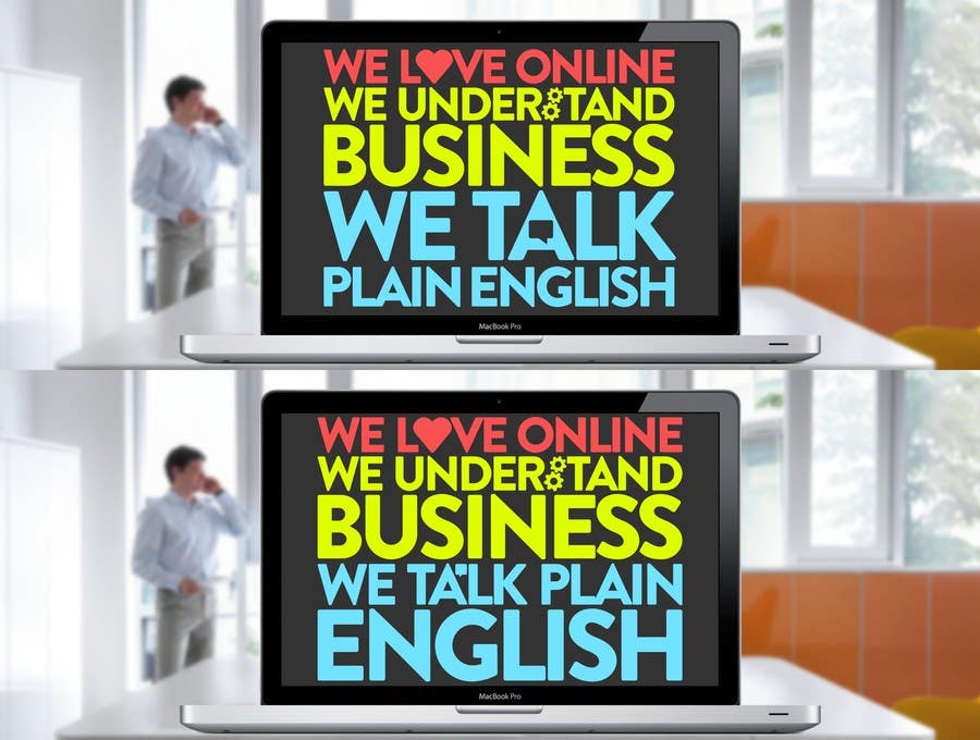
Changes as requested, added the small simple icons but i still have a few questions regarding this. What i didnt understood is by "padding" you wanted to fill up the gap between the lines or you wanted more clear space in-between them ? Also i'd like to ask if you prefer more uppercase letters over lowercase ? (such as this exemple) - altho it aint excluded that the next 2 banners could be easily done as lowercase, just asking :) P.S. Ive added 2 exemples of the typography, 2nd where is emphasis on the 'English' word, if it aint good just ignore it :) Thanks, awaiting news :) Catalin
Inscrição nº 46 do Concurso para                                                 Text design for website banners
Inscrição nº46

Painel de Comentários

  • phildegruchy
    Proprietário do Concurso
    • 10 anos atrás

    Can the other image use different pastel colours. perhaps green, pink, organe etc.

    • 10 anos atrás
  • phildegruchy
    Proprietário do Concurso
    • 10 anos atrás

    Hi Catalin,

    It really is getting there. :)

    * I prefer the "We talk plain" on one line and "English" on the next like the lower image.
    * I prefer the speech bubble within the "A" link on the top image.
    * By padding I meant some space between the three sentences but I think because of the different colours this can be ignored.

    Could you make the changes above and also have a go at one of the other images in a similar style but perhaps trying lowercase as well as uppercase.

    Thanks,
    Phil

    • 10 anos atrás