Business Card Design for ZD institute
- Status: Closed
- Prêmio: €135
- Inscrições Recebidas: 21
- Vencedor: markomavric

Síntese do concurso
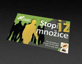
Economic crisis, lost generation, high unemployment rate ... It seems everywhere we look both printed and electronic publications as well as social networks, even casual conversations over coffee revolve solely around these grim prospects.
We are a no
Habilidades Recomendadas
Painel de Comentários
-

Khimraj
- 11 anos atrás
Hi, Please check my entries #70 #72 #77 #78 thank you !
- 11 anos atrás
-

PetaSmart
- 11 anos atrás
Hi Please review and feedback some change are welcome.
- 11 anos atrás
-
Predan
- 11 anos atrás
Hello C.H check my example #61 and give me a private feedback . Talk there for some changes or something else. Have a good day! Robert
- 11 anos atrás
-
Smartdotsteam
- 11 anos atrás
Check #50 tnx
- 11 anos atrás
-
Smartdotsteam
- 11 anos atrás
hello CH. check #48
- 11 anos atrás
-
Smartdotsteam
- 11 anos atrás
#49
- 11 anos atrás
-

tarhestan
- 11 anos atrás
hi, give feedback #45 please
- 11 anos atrás
-

aries000
- 11 anos atrás
We are waiting for your valuable feedback
Best regards- 11 anos atrás
-

randyjacob
- 11 anos atrás
ATTENTION DESIGNERS!
Invitation for logo inspiration site
You aLL have great design skills and We are inviting you to join the best logo inspiration site. Start submitting your creative logo to promote your work, your name yourself with your source link. You may have a chance to get directly contact with some clients through your email.
http://www.logolover.com
http://www.logolover.com- 11 anos atrás
-

hassanalashkar
- 11 anos atrás
#43 & #44
Give feedback please :))- 11 anos atrás
-

ValSVdesigns
- 11 anos atrás
Ok so #37 is now with a grey background. I also added a grey frame to the coffee section.
Feedback, please :)- 11 anos atrás
-

Proprietário do Concurso - 11 anos atrás
@yoezer32/ no 16 - love the front side, it's awesome, professional, yet creative - love the colors - but the back side needs some pimping. Perhaps we could go with a different photo of the crowd (maybe those peeps/character I've attached to the brief - sajirupee used an interesting picture of the crowd ...)I love the fact you combined the coffee invite and also the crowd sogan, but we need to separate them on the card more visable - like ValsVdesigns.
@ValSVdesigns, no 21 love it also, it's fun, offbeat and creative. Great improvement form the previouss one. I do miss some grey in it.
@Brandwar, no 23 - the back side needs some pimping - where can I put the text for the coffee invite?
@ivegotlost - bok sosed :) I need the back side with coffee invite and the crowd slogan;)
@sajirupee - a litlle to plain, but great picture of the crowd
If u have any questions, please give me a shout.
Thanks guys, you are all great.- 11 anos atrás
-
ValSVdesigns
- 11 anos atrás
Thanks so much for the feedback :)
Would you like me to maybe perhaps replaced the white of the front side of the card with a grey color?
Let me know!- 11 anos atrás
-
Proprietário do Concurso - 11 anos atrás
yeah, can we try it please? :) thank u.
- 11 anos atrás
-
Proprietário do Concurso - 11 anos atrás
designs - they were all interesting, but not in the way I wanted. I am a girl that likes the details and an interesting use of colors. I have kept the ones I like the most, but they do need some pimping. Authors of the eliminated designs can off course try agan, maybe it will be more clear about what I want in my bellow comments :)
- 11 anos atrás
-

ivegotlost
- 11 anos atrás
#26, a new one, partly transparent - to allow job seekers to see through the employers lies, and a dot/fade away style - to represent the disappearing working masses of EU. Dobro jutro, sosedi ;)
- 11 anos atrás
-

wademd
- 11 anos atrás
LoL... @Brandwar and @yoezer32 its funny to see designers only rely on cheap presentation tricks. Anyone can purchase these cheap tricks to make anything look good. http://tinyurl.com/cp8qa6a
- 11 anos atrás
-
ivegotlost
- 11 anos atrás
Marketing rules the world mate...
- 11 anos atrás
-

sajirupee
- 11 anos atrás
Hi. please feedback about #25. thank you :)
- 11 anos atrás
-
ValSVdesigns
- 11 anos atrás
Sorry, #21 (I noticed a misplace button on number 20) #21 is fixed. :)
- 11 anos atrás
-
ValSVdesigns
- 11 anos atrás
Oh and, of course text will be changed to appropriate language. :)
- 11 anos atrás
-
ValSVdesigns
- 11 anos atrás
Take a look at #20. I worked it so that it includes the coffee idea as well. Therefore, I have 2 versions, 1 (#13) without the coffee idea if you choose to do without it, and another (#20) with the coffee idea, and also a bit more color and design in the front.
Thanks!- 11 anos atrás
-
Proprietário do Concurso - 11 anos atrás
Will give a comment to each and everyone of you later in the afternoon (it's 1 PM in Slovenia :)) .
- 11 anos atrás
-
ValSVdesigns
- 11 anos atrás
Tell me what you think! #13!
- 11 anos atrás
-

Ayahmedia
- 11 anos atrás
please check #10 #11
i thought of sth instead of the box like the orange man stepping out from the crowd representing your institute
i would be glad if i can get any feed back- 11 anos atrás
-
Proprietário do Concurso - 11 anos atrás
The one with the crowd is something like i would have on the back of the card, but in a more colorful way. Like the FB an TW buttons. Number 1 and 2 are too plain, would like something to say. hey, look at me, I stand out :)
- 11 anos atrás
-
ivegotlost
- 11 anos atrás
OK, I'll see what I can do... thanks for the reply ;)
- 11 anos atrás
-
ivegotlost
- 11 anos atrás
Played a bit more - #7, totally unconventional for a card, but it does stand out :D
- 11 anos atrás
-

shiningtabreek
- 11 anos atrás
the preferred languages can be used in place of english, once the design appeals to u, thanks n rgrds
- 11 anos atrás
-
shiningtabreek
- 11 anos atrás
hi, i have uploaded the concept, kindly give the comments, looking forward for any alterations if any
thanks, tabreek- 11 anos atrás
-

MicroIce
- 11 anos atrás
Hello, I can provide you .psd files of this only.
- 11 anos atrás
-
ivegotlost
- 11 anos atrás
#3 is the back side idea...
- 11 anos atrás
-
ivegotlost
- 11 anos atrás
Hi CH. #1 is just a sketch of the front side style, to know is that something you're aiming for... Rate or reject and comment. Thanks!
- 11 anos atrás
Como começar com concursos
-

Publique seu Concurso Rápido e fácil
-

Obtenha Toneladas de Inscrições De todo o mundo
-

Premie a melhor inscrição Baixe os arquivos, é fácil!