peernoonari
Pakistan


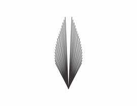
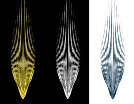
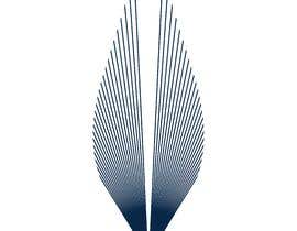
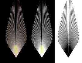
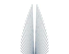
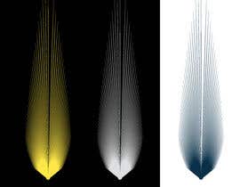
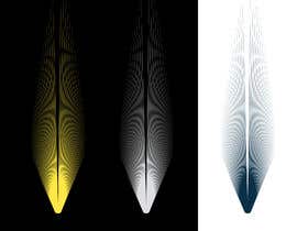
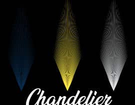
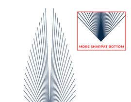
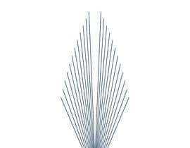
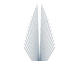
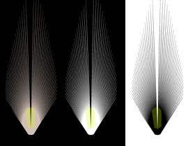
Chandelier is a new startup brand-building ad agency intended to spark loyal fans. I want this picture to be done in a logo, and sor of an arrow. ONLY A SINGLE reverse chandelier/arrow-esque icon. I like the broad outlines but it shouldn't be a copy of the picture, instead a logo based on the type of form. But reverse it so that it is a light chandelier hanging down, we'll have this going upward (the reverse direction) but looking the same going up like wings. Note: Please no word typography (on Chandelier), solely the icon logos. ALSO: Only ONE chandelier-esque type arrow. And I prefer if it is more dynamic, and looks svelte and cool. Thus, keep it more narrow on the bottom of the bulb, so the lines at the bottom have less flare and are more constricted (like an arrow) rather than splayed out and wider on the bottom lines to the sides. So the bottom lower lines are more upright, and pointed up than splayed out to the sides. Also, keep the lines symmetrical, as a good logo doesn't have lines that are not balanced on each side! Thus, make the spikes symmetrical on both sides It needs to be narrower at the bulb-base and more upright as it is more about the angle of the spikes from the base and we DON'T want it not to be very flowery but more masculine, more dynamic and aerodynamic-type look - so it looks cool - which I imagine is a more consolidated and constricted area at the base.
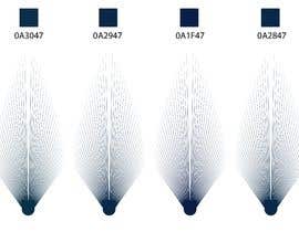
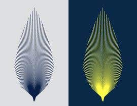
PLEASE USE Black OR THESE TWO COLORS ARE BASICALLY Navy Blue/Bright Yellow e.g. BLUE: #0A3047 (Prussian Blue)/#0A2947 (Prussian Blue)/#0A1F47 (Oxford Blue)/#0A2847 (Oxford Blue)/#0A1947 (Penn Blue) or YELLOW: #FFE747 (Maize)/#FFED47(Maize)/#FFF047 (Maize)/#FFF947 (Icterine)/#F9FF47 (Yellow)/#F6FF47 (Icterine) from https://coolors.co/0a1f47-fff947.
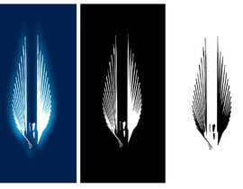
Also, a shaded offwhite/white could be neat using #DCDEDF (Platinum)/#E4E8EC (Anti-flash White) with a bright white #FFFFFF (White).. but this is a subservient color/design.
Please use the attached as guidelines unless you have something you think is significantly better. USE THE LOGOS THAT ARE INDICATED AND MAKE SLIGHT ADJUSTMENTS - THOSE WILL BE THE FAVORED ONES. Points for creativity IF it looks good - so feel free to be creative - but if it isn't superior, then stick to the pictures and do them better or best you can.


Publique seu Concurso Rápido e fácil

Obtenha Toneladas de Inscrições De todo o mundo

Premie a melhor inscrição Baixe os arquivos, é fácil!