Design a Logo for a taxi search app
- Status: Closed
- Prêmio: $50
- Inscrições Recebidas: 35
- Vencedor: alexandracol

Síntese do concurso
I need a logo designed for an app, i want to incorporate 3 things so people have a good understanding of what the app does.
The 2 important things to get across are
1 - That its an Irish company
2 - That you use the app to search for or scan for a taxi
The name of the company is Taxi Scanner. I'm open to color themes, the app itself will be a dark theme with blue shades so i'm thinking yellow and blue or maybe yellow and black might be ideal
I want the PSD and ideally the logo will be a large size so i can use it on stationary or websites later if needed.
Update:
Guys, some good designs there but i think most have forgotten one of the 2 main criteria that it should be obvious that its an Irish company. I think either the use of green, white and gold shading or possibly font or even a small flag might be the best idea but i will leave it up to your creativity.
Also i like the idea of emphasizing your searching for the taxi by putting one or more taxis on a map or road as long as you can keep it professional looking, i'm trying to avoid it looking like a taxi game as there are lots of them too so anything like 14 for example is giving the wrong impression however 14 done a good job of making it obvious its an app to search for taxis.
I'm undecided on the magnifying glass, i think most of them don't look that good but maybe someone can make one with it look more professional. Another option i like is using radar to find the taxi too, i think people could do some creative stuff with that like one quarter or half section of the radar is showing a map with 2-3 taxis on it and the rest is a radar.
That's just a suggestion, use your creativity to make something that works. Just remember it needs to be obvious this is searching for taxis and that its an Irish company although the Irish part can be more subtle.
Update: 26th June
I done a mock of an example i like, i am really looking for something like that but obviously this was thrown together quickly so youll need to use your creative skill to make it look much better.
I would not like to use google maps in the background, i want something similar but just dont use a clone of google maps as there might be copyright issues doing that but i do want it in that same type of clipart form where its obvious that its a map.
If you think a similar but different variation is better please go ahead, nothing is set in stone but i thought my image might help in showing how i want to make it clear this is a map and im scanning for taxis and also that its based in Ireland. I do like the bevelled edge round designs so please try and incorporate that
https://www.dropbox.com/s/hx2j067fx25yl0i/cab_scanner.png
p.s i made a last minute change of mind on the name and im going with Cab Scanner instead of Taxi Scanner
Habilidades Recomendadas
Feedback do Empregador
“@alexandracol won the contest on 28 June 2013”
![]() morny, Thailand.
morny, Thailand.
Painel de Comentários
-

arshadsyed79
- 10 anos atrás
why you closed before the time................i made a better one of this that you chosen
- 10 anos atrás
-

zeontechnologies
- 10 anos atrás
Please check #63
- 10 anos atrás
-

alexandracol
- 10 anos atrás
Please check #53 #55 . Thank you!
- 10 anos atrás
-

Proprietário do Concurso - 10 anos atrás
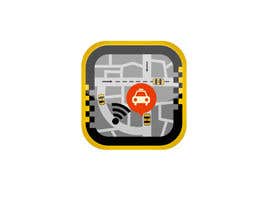
Ok, i'm pretty much set on choosing #53 but i need 2 changes. As mentioned previously there is too much yellow, since the cabs are yellow they are hard to notice and they are one of the focal points. Can you make the road a light grey or pale color and make the land sections maybe a slightly darker gray color or a really pale yellow, this should help the taxis stand out. Also i dont think the green white and yellow radar works, it just doesnt look like an obvious radar like you can see in #46 where it is very obvious what it is. So if you change it to black or something dark and tidy up the arcs i think it will look more realistic
- 10 anos atrás
-
alexandracol
- 10 anos atrás
Hi.Ok. I will change that. thank you for the feedback!
- 10 anos atrás
-

swaycher95
- 10 anos atrás
Hi, how are u? Please check the #56 & #57 and give me your feedback. Thank u
- 10 anos atrás
-
Proprietário do Concurso - 10 anos atrás
#48 really good, some minor suggestions, remove the Cab Scanner text, add in a bubble showing the taxi like you did in #51 but make the bubble bigger so its obvious when viewing at lower resolution its a taxi and then reduce the color on the map so its more transparent as there is too much bright yellow going on, the yellow on the border is nice so no need to reduce the opacity for that, if you can pull that off i think this could be the one
- 10 anos atrás
-
alexandracol
- 10 anos atrás
Ok. I will make the change right now. Thank you!
- 10 anos atrás
-
alexandracol
- 10 anos atrás
Hi. Please check my new entry! Thank you!
- 10 anos atrás
-
zeontechnologies
- 10 anos atrás
Hi,
Thanks for the feedback on #41 , I'm working on it for 2nd iteration .Any other comment/guide to make it perfect plz ?- 10 anos atrás
-
Proprietário do Concurso - 10 anos atrás
#45 is a great improvement. Since this logo will be displayed in the store it is important the name is displayed within the logo, can we make the map smaller so we can put the name in, also see the way i done the cab logo beside the name in my mock, i think that would look well https://www.dropbox.com/s/4msiwvmnlm02r58/Yellow_buttonPSD.png
Finally, the font is ok but since we also want to highlight the name i would like to see something with the font to make it stand out. Maybe thats a different font, a background color, a background like #41 done for scanner or something just to bring it to life and make it stand out a bit more- 10 anos atrás
-
alexandracol
- 10 anos atrás
Hi. Thank you for the feedback and for rating my design. I will be back with another concept. Thanks again!
- 10 anos atrás
-
Proprietário do Concurso - 10 anos atrás
Actually i take that back about #45 , the name doesnt need to be in the logo but still i would like to give the font a bit of an overhaul as i mentioned
- 10 anos atrás
-
Proprietário do Concurso - 10 anos atrás
#40 i like the concept but i had to squint to figure out that those were roads and taxis so a user wont get the message quick enough from that image but would like to see a variation possibly where 1/4 or 1/2 of that radar was like a map in the image i posted below with the smartphone, that might look well.
- 10 anos atrás
-
Proprietário do Concurso - 10 anos atrás
Forgot the link to my mock again in relation to #41 https://www.dropbox.com/s/4msiwvmnlm02r58/Yellow_buttonPSD.png
- 10 anos atrás
-
Proprietário do Concurso - 10 anos atrás
I like #41 , your one of the few that made an attempt to put the Irish theme into it and that was a clever and subtle way to do it. The only issue is it looks more like the cab is searching rather than the user. btw i really am keen to keep the square dimension like in #42 . Your version gave me a bit of inspiration, i know this looks crappy but the message that the smarthphone with the map on it gets across is powerful, if someone can make something close to this but make it much more sexy, better font etc then i think were onto a winner.
- 10 anos atrás
-
zeontechnologies
- 10 anos atrás
please check #41
- 10 anos atrás
-
Proprietário do Concurso - 10 anos atrás
map is great, but just lacking some sexiness or that professional look, if you compare the button in no.7, see how it looks very professional, im not sure why but the shape just looks slightly off.
- 10 anos atrás
-
alexandracol
- 10 anos atrás
Hi! Please check my new entry #38 . Thank you!
- 10 anos atrás
-
Proprietário do Concurso - 10 anos atrás
thanks the flash light radar affect is nice but its too dark overall and the graphics/fonts are too plain
- 10 anos atrás
-
mehdiafter
- 10 anos atrás
#37
- 10 anos atrás
-
Proprietário do Concurso - 10 anos atrás
Also i think the blue in the road map takes away from the roads which is the main focus, i dont know what you would use instead of blue, maybe a grass type color but maybe some subtle changes can make it more obvious its a map and those bubbles are taxis
- 10 anos atrás
-
Proprietário do Concurso - 10 anos atrás
I like the way you used the radar on the C in Cab, nice touch. The map is definitely going in the right direction, it could have more clarity but its not bad just doesnt make it overly obvious were talking about taxis as the bubbles are generally related to location but not necessarily taxis. I'm kind of leaning towards having a more square looking logo, doesn't have to be on a square button with rounded edges, i can easily do that later if the image dimensions is more square but i kind of like the button style like in 11, 2, 26 and a few more. Good first attempt though.
- 10 anos atrás
-

Gabriela5
- 10 anos atrás
#34 :)
- 10 anos atrás
-
Gabriela5
- 10 anos atrás
#33 :)
- 10 anos atrás
-
Proprietário do Concurso - 10 anos atrás
1 last thing, i made a last minute change on the name, im going with Cab Scanner instead of Taxi Scanner
- 10 anos atrás
-
Proprietário do Concurso - 10 anos atrás
Sorry forgot link, its in the description too
https://www.dropbox.com/s/hx2j067fx25yl0i/cab_scanner.png- 10 anos atrás
-
Proprietário do Concurso - 10 anos atrás
I done a mock of an example i like, i am really looking for something like that but obviously this was thrown together quickly so youll need to use your creative skill to make it look much better.
I would not like to use google maps in the background, i want something similar but just dont use a clone of google maps as there might be copyright issues doing that but i do want it in that same type of clipart form where its obvious that its a map.
If you think a similar but different variation is better please go ahead, nothing is set in stone but i thought my image might help in showing how i want to make it clear this is a map and im scanning for taxis and also that its based in Ireland. I do like the bevelled edge round designs so please try and incorporate that- 10 anos atrás
-
Proprietário do Concurso - 10 anos atrás
Im undecided on the magnifying glass, i think most of them dont look that good but maybe someone can make one with it look more professional. Another option i like is using radar to find the taxi too, i think people could do some creative stuff with that like one quarter or half section of the radar is showing a map with 2-3 taxis on it and the rest is a radar.
Thats just a suggestion, use your creativity to make something that works. Just remember it needs to be obvious this is searching for taxis and that its an Irish company although the Irish part can be more subtle.- 10 anos atrás
-
Proprietário do Concurso - 10 anos atrás
Guys, some good designs there but i think most have forgotten one of the 2 main criteria that it should be obvious that its an Irish company. I think either the use of green, white and gold shading or possibly font or even a small flag might be the best idea but i will leave it up to your creativity.
Also i like the idea of emphasizing your searching for the taxi by putting one or more taxis on a map or road as long as you can keep it professional looking, im trying to avoid it looking like a taxi game as there are lots of them too so anything like 14 for example is giving the wrong impression however 14 done a good job of making it obvious its an app to search for taxis.- 10 anos atrás
-
nishuclm
- 10 anos atrás
Do you like earn money?
This is a realy PTC site. I am working in this site and i payout
$ 84 last week. If you want to earn money signup today using below link.
It's very easy complete this step by step and earn money now.
Step 1: go this link
http://www.clixsense.com/?5105297
step 2: sign up this site
step 3: view ads and earn money now. Quckly.
I already earned about $15 per one day in this site.
Good Luck!- 10 anos atrás
-

daam
- 10 anos atrás
please check #7 , and give feedback :),
- 10 anos atrás
Como começar com concursos
-

Publique seu Concurso Rápido e fácil
-

Obtenha Toneladas de Inscrições De todo o mundo
-

Premie a melhor inscrição Baixe os arquivos, é fácil!