Design a Logo for StressControl Product
- Status: Closed
- Prêmio: £250
- Inscrições Recebidas: 143
- Vencedor: vicked

Síntese do concurso
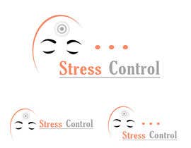
This is a logo for a DVD home study course called "StressControl - How to Develop Unshakable Resilience for More Money and More Life".
I've created my own initial version of the logo attached 'stresscontrol-logo-v0.5.jpg'.
The idea here is to use the two types of motivation. To create a desire for people to buy the product on the basis that they want to move AWAY from the pain of Stress and TOWARDS the pleasure of resilience and living life calmly.
The possibilities for this logo are almost endless but here are my ideas.
See attached file stresscontrol-logo-v0.6.jpg. This shows an extra part which is an arc over the 'R' and the 'O'. This is where some kind of gradient could go to represent the process of going from Stress (red) to calmness (blues and greens). This could be represented by things like
1. A rainbow
2. A thermometer
3. A pressure guage
4. Dots or crystals (like chakra points) - see http://www.shutterstock.com/cat.mhtml?lang=en&search_source=search_form&version=llv1&anyorall=all&safesearch=1&searchterm=chakras&search_group=#id=137911115&src=JOpT4nWHayc2Eb0mEezb8A-1-49
5. The evolution of man image but the colour of the men goes from red gradually to blue from left to right. I've attached a file 'evolution.jpg' which gives an example of the evolution of man concept but this is only an example. If you use this concept in your design, make the same but just different colour as they become less 'stressed'.
6. The idea of 'balance' like some scales or something
7. A shield, a bubble or a force-field (to represent resilience)
8. Stability
This course is transformational so images of that nature could also be included. Butterflies are associated with transformation.
One of the key concepts in the course is of a tap dripping water into a bucket. I have this idea that the 'L' from 'Control' could have a tap on top of it facing backwards, which is then dripping water droplets into the 'O' of 'Control' and the 'O' is shaped like a bucket somehow.
I don't expect you to use ALL the ideas in the logo, that will be too much. I want to convey the benefit of the product visually.
Again to be clear, the benefit of the product is that it will teach people how to go from being stressed out to living life calm and relaxed.
We are talking about changing peoples emotions from bad to good so bear that in mind with the design. The logo needs to reflect those feeling visually.
My favourite idea out of all of them is the tap and bucket idea because people will come to know it and it will remind them of what they learned every time they see it.
Habilidades Recomendadas
Feedback do Empregador
“@vicked won the contest on 19 June 2013”
![]() uslvw, United Kingdom.
uslvw, United Kingdom.
Painel de Comentários
-

razer69
- 10 anos atrás
#121 i can change color and font if u want. I did not get tym to send those samples.. Ty. If you like to change anything plz pm me.
- 10 anos atrás
-

amauryguillen
- 10 anos atrás
please check #172
- 10 anos atrás
-
Mach5Systems
- 10 anos atrás
Please comment on 151,152 with little variations, please READ DESCRIPTION the EACH LOGO. Any variations can be done, you can please let me know if need one.
- 10 anos atrás
-
Mach5Systems
- 10 anos atrás
Please comment on 150, please READ DESCRIPTION the EACH LOGO.
- 10 anos atrás
-
habitualcreative
- 10 anos atrás
sir please check out #148
- 10 anos atrás
-
Mach5Systems
- 10 anos atrás
Please comment on 147, please READ DESCRIPTION OF EACH LOGO.
- 10 anos atrás
-

kasif20
- 10 anos atrás
dear CH, all my designs are samples, i will enhance them if you like any one of them on ur demand
- 10 anos atrás
-
Mach5Systems
- 10 anos atrás
Please comment on 137,138,139,140,142,143 please READ DESCRIPTION OF EACH LOGO.
- 10 anos atrás
-
Mach5Systems
- 10 anos atrás
Please comment on 137,138,139,140 please READ DESCRIPTION OF EACH LOGO.
- 10 anos atrás
-
Mach5Systems
- 10 anos atrás
Please do comment on 137
- 10 anos atrás
-
DigiMonkey
- 10 anos atrás
Hi, please check #134 and leave some feedback.
TY- 10 anos atrás
-

stanbaker
- 10 anos atrás
Please review my submission number 91. Thank you.
- 10 anos atrás
-
stanbaker
- 10 anos atrás
Please review my submission number 90. Thank you.
- 10 anos atrás
-
stanbaker
- 10 anos atrás
Please review my submissions numbers 88 and 89. Thank you.
- 10 anos atrás
-
casdesignstudio
- 10 anos atrás
Please check and review #87 , please read description
- 10 anos atrás
-
amauryguillen
- 10 anos atrás
please can you provide some feedback so i can make a better design? thanks
- 10 anos atrás
-
SheryVejdani
- 10 anos atrás
Please feedback on #58 and #59 ?!!?!!!!! I'd appreciate, Thanks.
- 10 anos atrás
-

vicked
- 10 anos atrás
Please check #56 and provide feedback
- 10 anos atrás
-

Gordana86
- 10 anos atrás
Hello, any comments on #39 ? Thank you.
- 10 anos atrás
-
vicked
- 10 anos atrás
Please provide feedback for #56
- 10 anos atrás
-
vicked
- 10 anos atrás
Please have a look at #54 and #55 and provide feedback.
- 10 anos atrás
-
amauryguillen
- 10 anos atrás
please check #52 thanks
- 10 anos atrás
-

YouYou4u
- 10 anos atrás
pls give all ur feedback!
- 10 anos atrás
-
YouYou4u
- 10 anos atrás
hope u like #36 ...
HOPE YOU LOVE THE action and trust me,
when u look at it you feel the stress anger... ten the fire truck control! :)- 10 anos atrás
-

Designer0713
- 10 anos atrás
#34 Thanks! :)
- 10 anos atrás
-

Proprietário do Concurso - 10 anos atrás
Because one of the brand values is silver, this should definitely be included.
- 10 anos atrás
-
Proprietário do Concurso - 10 anos atrás
A person in stress feels out of control so the first thing they want is a sense of safety and certainty. They often feel that they are on their own and lack connection with other people. They feel they lack love and understanding, so the logo should give clues that the product offers these things.
- 10 anos atrás
-
Proprietário do Concurso - 10 anos atrás
Vibrant orange is good, consider lilac but be careful not to make it too girly because it will put off male customers.
We need to be careful with the font. A stressed font is not going to work. The one I showed in my example was just to get the ball rolling.- 10 anos atrás
-
Proprietário do Concurso - 10 anos atrás
It's aimed 80% at women and 20% at men, so the logo needs to have curves.
Looking at the designs, we need to stay away from black and dark colours.- 10 anos atrás
-
Proprietário do Concurso - 10 anos atrás
It has to be on a white background, should be simple, clean and have even spacing.
It should look clear and calm. Virgin and untouched.- 10 anos atrás
-
Proprietário do Concurso - 10 anos atrás
OK we are doing well but are still missing the mark. Let me give some additional guidance.
Think about the situation a customer will be in. They will be stressed. So the way we will get their attention is to offer them the alternative. It almost instantly needs to make them feel calmer by looking at it.- 10 anos atrás
-
amauryguillen
- 10 anos atrás
please check #24 thanks
- 10 anos atrás
-
casdesignstudio
- 10 anos atrás
Please leave review on #13 on what i can improve on. Thank you very much.
- 10 anos atrás
-
Designer0713
- 10 anos atrás
Please check #12 Thanks! :)
- 10 anos atrás
-
Proprietário do Concurso - 10 anos atrás
This is by far the best design yet. I can't even think of any feedback to give.
- 10 anos atrás
-
Designer0713
- 10 anos atrás
Thank you so much! :)
- 10 anos atrás
-

man25081983os
- 10 anos atrás
Hello, thanks for the rating regarding #18 . Could you please give me some feedback as well? Thanx a lot!
- 10 anos atrás
-

clickinnovate
- 10 anos atrás
Please provide feedback on #7 - thanks.
- 10 anos atrás
Ver mais 2 mensagens
-
clickinnovate
- 10 anos atrás
It's #16
- 10 anos atrás
-
clickinnovate
- 10 anos atrás
I've also explored your tap concept #17 . I'm happy to make adjustments if you let me know. Thanks!
- 10 anos atrás
-
casdesignstudio
- 10 anos atrás
Please check my entry #13 . Thanks.
- 10 anos atrás
-
Proprietário do Concurso - 10 anos atrás
The logo needs to remain landscape like my example. That means I should be able to draw a horizontal rectangle around it.
- 10 anos atrás
-

kavalagreece
- 10 anos atrás
I am a professional graphic designer, give me an email to sen you my portfolio. Thank you.
- 10 anos atrás
Como começar com concursos
-

Publique seu Concurso Rápido e fácil
-

Obtenha Toneladas de Inscrições De todo o mundo
-

Premie a melhor inscrição Baixe os arquivos, é fácil!