Painel de Comentários

  • davidr2
    Proprietário do Concurso
    • 9 anos atrás

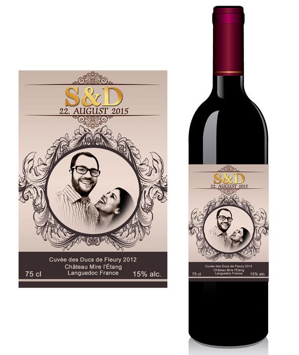
    my friend likes this one a lot - can you put some more space between the letters of "S&D" (more like "S & D") - move the center ornament a bit away from the top ornament (where the black and dark red meet) - and therefore reduce the lowest (dark grey) section a bit in height - and select a more "vintage" / rustic font for that…?

    • 9 anos atrás
    1. davidr2
      Proprietário do Concurso
      • 9 anos atrás

      thanks ahmed! please also upload something without gold color...

      • 9 anos atrás
    2. AhmedAmoun
      AhmedAmoun
      • 9 anos atrás

      done dear entry #9

      • 9 anos atrás