NEED SIMPLE, CREATIVE EMBLEM/IMAGE DESIGN TO SHOW ENERGY AND LIFE
- Status: Closed
- Prêmio: $110
- Inscrições Recebidas: 68
- Vencedor: niteingale

Síntese do concurso
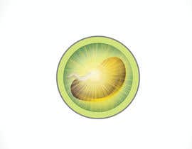
Need creative image designed showing energy around a seed. Please see project details.
Habilidades Recomendadas
Feedback do Empregador
“Niteingale has great work ethics and worked diligently on a project for us. She submitted over 70 entries to a contest which she worked hard at. She not only won the contest but gave us a superior product which we are more than 100% satisified with. She is prompt with communications, does an excellent job and works hard to please. Having been an employer on Freelancer and other sites for many years, I know the headaches involved by having people disappear or doing a poor job at their work. This artist proved her fortitude and skills over and over to me. I would therefore recommend her. A+”
![]() diasan10, United States.
diasan10, United States.
Painel de Comentários
-

Proprietário do Concurso - 11 anos atrás
Thanks to you fellow artists for ALL the work you did on this project. We sincerely appreciate all of your efforts!
- 11 anos atrás
-

shaynefly
- 11 anos atrás
Thanks for all your feedback and congratulations to Niteingale. Unfortunately, time slipped away from me in the end.
- 11 anos atrás
-

niteingale
- 11 anos atrás
Thanks Shaynefly...I was wondering why you pulled out myself, sorry to hear about the time constraints. Just wanted to tell you I loved your dead seed designs. You helped push my creative aspect of this design and it was a pleasure competing with you in this contest. All the best !
- 11 anos atrás
-
Proprietário do Concurso - 11 anos atrás
Congratulations, Nitengale for an exceptional job and for sticking in there and producing over 70 images for us to choose for our design!!! Your work was amazing and we are very grateful!!!
- 11 anos atrás
-
niteingale
- 11 anos atrás
Thanks again and I am happy you loved the designs. It was a pleasure working with you. The design would not have been possible without your guidance and direction (and all the tips) towards the final product. Thanks for hanging in there with me and getting me to this point. I truly appreciate your feedback, it was on point and I couldn't wish for a better CH.
- 11 anos atrás
-
Proprietário do Concurso - 11 anos atrás
And by hanging in there and tweaking all of these images, she did an excellent job and gave us exactly what we're looking for!!! So, for this - we award NITENGALE as the WINNER of this contest!!!!!!!!!!!!
- 11 anos atrás
-
Proprietário do Concurso - 11 anos atrás
Waaaaay more than we ever expected from anyone.
- 11 anos atrás
-
Proprietário do Concurso - 11 anos atrás
And Niteingale worked and worked... and yes, worked on it tirelessly to get it right.
- 11 anos atrás
-
Proprietário do Concurso - 11 anos atrás
Dead seeds - or those that are destroyed by cooking and have very little to no enzymes at all - are difficult to draw. There's texture and ripples to the skin. There's irregular edges and lighting issues. A lot of things.
- 11 anos atrás
-
Proprietário do Concurso - 11 anos atrás
Early on, Niteingale introduced white light besides yellow light to represent the energy coming from the seed. This was a great idea not only in a spiritual sense (white light associated with life) but it really worked out well in the live seed. She continued to improve her live seed, having a tiny, some what inconspicuous sprout coming from it and the entire seed radiated that energy we wanted to capture. Her dead seed, however... needed some work.
- 11 anos atrás
-
Proprietário do Concurso - 11 anos atrás
Niteingale has been designing right along since the beginning and for a bit of time, side-by-side to Shaynefly. Both of them cotinually improving their designs.
- 11 anos atrás
-
Proprietário do Concurso - 11 anos atrás
Because we felt that things were really progressing along, we extended the contest to allow these artists as well as others to develop this concept even further. Shaynefly created some cool looking auras and a nice texture to the 'dead' seed. But, he seemed to drop out after we extended the contest. We would have loved for him to tweak the design a bit more like changing the position of the sprout, a little less yellow in the aura. The opening of the dead seed really needed to be closed, too. But overall, these were really cool designs and there was a lot of believability to these seeds. But was it enough? There was still Niteingale's work...
- 11 anos atrás
-
Proprietário do Concurso - 11 anos atrás
While many renditions were very interesting and creative and we're truly appreciative of everyone's efforts, two artists stand out. They are Shaynefly and Niteingale.
- 11 anos atrás
-
Proprietário do Concurso - 11 anos atrás
Shpmadushanka provided an interesting rendition and stated that he took the original photo of the developing sprout plant. We questioned this and have since found the identical sprout on the internet at the following link: http://www.harvesttotable.com/2010/01/seed_failure_troubleshooting/bean-sprout-2/ and therefore have disqualified him from the contest as we clearly stated that we did not want someone's copyrighted information/images in this contest. In addition, we wanted a hint of a sprout, not the entire plant starting to emerge.
- 11 anos atrás
-
Proprietário do Concurso - 11 anos atrás
There were others who joined in. Pete222, sgsuk, and shpmadushanka came in and entered the contest too with some interesting renditions.
- 11 anos atrás
-
Proprietário do Concurso - 11 anos atrás
Shaynefly and Niteingale kept plugging along at it and Niteingale produced over 70 different designs. But was this enough?
- 11 anos atrás
-
Proprietário do Concurso - 11 anos atrás
Each brought their own creative angle to what this live energy would look like.
- 11 anos atrás
-
Proprietário do Concurso - 11 anos atrás
Then Svitlana92 and Milos009 joined along.
- 11 anos atrás
-
Proprietário do Concurso - 11 anos atrás
At first, we had Shaynefly and Niteingale come out of the gates and work hard at creating this live energy produced from a sprouting seed.
- 11 anos atrás
-
Proprietário do Concurso - 11 anos atrás
So, all of this information is all represented by one tiny seed starting to sprout and being able to see, in some type of representation, the energy that the sprouting seed provides us. And, that is what this contest is all about.
- 11 anos atrás
-
Proprietário do Concurso - 11 anos atrás
If we eat more live enzymes in our diet, our metabolic enzymes aren't wasted on trying to digest food (when we have digestive enzymes that can do that) but instead, are spent on healing and strengthening our body.
- 11 anos atrás
-
Proprietário do Concurso - 11 anos atrás
We can get an abundance of enzymes through living foods such as sprouted seeds, raw fruits and vegetables and fermented foods that are not pasteurized.
- 11 anos atrás
-
Proprietário do Concurso - 11 anos atrás
Make that, 'without eyzmes' we die within seconds.
- 11 anos atrás
-
Proprietário do Concurso - 11 anos atrás
When we are born we are given a certain amount of enzymes for our life. Our body uses these enzymes to do everything you and I can do. Our ability to think, see, feel, digest food, every organ to work, grow new hair, skin - every single thing that we represent as life to us. It all comes from our body using enzymes. It's kind of like the 'labor force' within us. Within enzymes, we die within seconds.
- 11 anos atrás
-
Proprietário do Concurso - 11 anos atrás
This project wasn't a typical project one had to drawn in that you had to capture what energy looked like and relate that to a seed sprouting.
- 11 anos atrás
-
Proprietário do Concurso - 11 anos atrás
Shpmadushanka - It looks like you've used someone's copyrighted image of a sprout which is not allowed. It looks nice but I question if it is your original work as you haven't been showing versions of it in this contest and just all of a sudden show this. Perhaps I'm wrong. If so, explain otherwise.
- 11 anos atrás
-

shpmadushanka
- 11 anos atrás
Image of sprout is taken from actually a photograph by me. I think that doesn't violate any law. If you need i can provide the original. And thanks for the feedback,
- 11 anos atrás
-
Proprietário do Concurso - 11 anos atrás
I'd love to see the original.
- 11 anos atrás
-
Proprietário do Concurso - 11 anos atrás
One other point to mention to you artists is that when you choose a seed, be sure you know where at in the seed it starts to sprout. Often times, they're in the middle, not at the top so it's important to draw it that way. So far, Shaynefly's #42 looks the best as far as the aura. It doesn't need to have the green stem coming out but the aura is great. Think if the light 'glitter' or beam from a diamond. Think of the rays of light sparkling off the ocean. I want that sparkle, that aura - that light --- coming from the sprouting seed.
I hope this helps! Remember - think simple. A 10 year old should 'get it' when he/she first looks at it. Don't make it too intricate because no one will look at it that long to understand it. It has to be impressionable and something that people understand within a second or two --- or, maybe 3! :)- 11 anos atrás
Ver mais 28 mensagens
-
Proprietário do Concurso - 11 anos atrás
Okay, the dead one doesn't look believable. It's not bad, just doesn't look like a seed - or a dead one. The live one? Well, the aura can still be improved. It seems like too much solid yellow - or too much yellow altogether. Maybe add some white in there and improve the sprout a bit. Thanks so much for your efforts! It's definitely coming along!
- 11 anos atrás
-
Proprietário do Concurso - 11 anos atrás
Here's a thought, too. What about turning the circle around so the sprout is going up instead of down. Has a different feel going up.
- 11 anos atrás
-
Proprietário do Concurso - 11 anos atrás
Niteingale - your live seed looks wonderful. It captures the energy and is believable. Improve a bit on the sprout part but don't make it too big. Your dead seed - well, it looks pretty dead! :o) But, it doesn't look interesting and isn't believable. Go with the same seed as the live one, add changes to it like shrivel lines (think raisin) with irregular edges. You're on the right track with the little aura you have. You don't have to go so dark of a brown for the dead seed, either. And, maybe a different texture for the background of the seed. I know you have it in you to improve this and look forward to seeing the change!
- 11 anos atrás
-
niteingale
- 11 anos atrás
Thanks, I will definitely take your points and make the much needed changes...and thanks for extending the contest, I will try my best to come up with something a bit more. Considering the progress of the live seed, I think I can get the dead seed done. I will try to upload as soon as possible but only once I come up with a great dead looking seed (or at least close to it). Thanks again
- 11 anos atrás
-
niteingale
- 11 anos atrás
Uploaded a few...I will await your review to make corrections if needed
- 11 anos atrás
-
Proprietário do Concurso - 11 anos atrás
Milos - You're on the right track but I don't like the beam lights coming out of the seed and don't care for the purple background.
- 11 anos atrás
-
Proprietário do Concurso - 11 anos atrás
Okay, fellow artists. I have decided to extend the contest and make it guaranteed. I will give my input as of now.
Shaynefly - you have a nice looking 'dead' seed but it's too dark. Make it lighter brown and have a little aura around it. The live seed looks good but you're getting too much aura around it where the entire background is yellow. I don't like the color of border you're using. Make it more yellow green than light blue green. And the sprout part doesn't have to be as tall. It's all about the seed and the aura. The sprout is important but not as important as the seed and aura. And again, watch the aura. It's getting too big where it's taking over the entire background color, etc. Some of your earlier versions looked better. You're definitely on the right track though, and it's looking great!- 11 anos atrás
-
Proprietário do Concurso - 11 anos atrás
Shpmadushanka - Did you draw 101?
- 11 anos atrás
-

Milos009
- 11 anos atrás
I hope it's better now .
Please review #88- 11 anos atrás
-
Proprietário do Concurso - 11 anos atrás
Yes, those look better. Thank you!
- 11 anos atrás
-
Milos009
- 11 anos atrás
#104 , #103 , #102 feedback please!
- 11 anos atrás
-
Proprietário do Concurso - 11 anos atrás
Regarding the dead seed, think 'raisin' or dried corn on the cob. These will give you the ideas of the irregular shape and edge to the 'dead seed'. But, I don't want an image of a raisin or dried corn. Just gave those as a reference. You can also google 'bean sprout seed' to see what that first sprout looks like.
- 11 anos atrás
-
Proprietário do Concurso - 11 anos atrás
Hey, fellow artists! I just saw something that will help you even more! Google or Bing 'eclipse' and you'll see the type of light/aura that I am looking for. I think this will improve your drawings even more. Some that have little light behind can be like the 'nearly dead' seed and the others with a lot of light can be for the one with a lot of energy! See if that doesn't help you! :)
- 11 anos atrás
-

zubairblaze
- 11 anos atrás
he, pleaes feedback for #81
- 11 anos atrás
-
Proprietário do Concurso - 11 anos atrás
It looks fake and not interesting. Thanks for trying!
- 11 anos atrás
-
Milos009
- 11 anos atrás
Please check #73 ,#74,#75
- 11 anos atrás
-
Proprietário do Concurso - 11 anos atrás
I need it to be a bit more exciting. They look boring. And, the sprout doesn't start with a green leaf. It starts with a light tan 'root' looking sprout. Thanks.
- 11 anos atrás
-
Milos009
- 11 anos atrás
Thank you.
- 11 anos atrás
-

theethanlawrence
- 11 anos atrás
Hello. If you could give some feedback on #53 , that'd be much appreciated. It has two in it, one with and one without a sprout. I took into account what you've said on your other feedback messages, while also trying something a little different. Thanks!
- 11 anos atrás
-
Proprietário do Concurso - 11 anos atrás
I understand what you're trying to accomplish with the lights coming out of the side of the seed but that's what it looks like - lights - instead of an aura. It reminds me of a spaceship. So, try some other approaches that has an aura like 42, 60 and 62. I particularly like 42's aura but need it larger. Read my other comments regarding other artist's work. You're on the right track. Just would like to see that aura differently. Thanks!
- 11 anos atrás
-
niteingale
- 11 anos atrás
Thanks, submitted some two other designs (vary slightly from each other).
- 11 anos atrás
Como começar com concursos
-

Publique seu Concurso Rápido e fácil
-

Obtenha Toneladas de Inscrições De todo o mundo
-

Premie a melhor inscrição Baixe os arquivos, é fácil!