Tweak my logo ever so slightly to make it more "interesting" to the eye

  • Status: Closed
  • Prêmio: $10
  • Inscrições Recebidas: 37
  • Vencedor: AM7seconds

Síntese do concurso

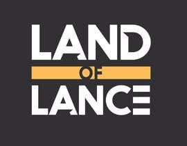
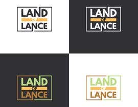
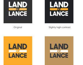
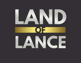
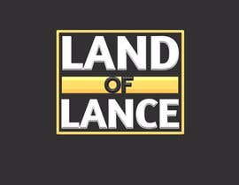
I like my logo but it's not incredibly creative. I need a high quality refresh of this. I don't need it to deviate much. I just wonder if we can add some shadowing, lines, etc. to make the logo more interesting but generally keep it in tact as is. Make sense? Thanks!

Habilidades Recomendadas

Feedback do Empregador

“Ash is very talented and super easy to work with. I will definitely use him for more projects at another time. Thank you! ”

Foto do perfil bluegrassflash, United States.

Principais inscrições deste concurso

Ver Mais Inscrições

Painel de Comentários

  • mdashef
    mdashef
    • 4 anos atrás

    i had also designed some logo would you like to see,
    i have designed it with take time but you choose a winner ,
    i should also get a chance to submit my logo.
    please inbox me.

    • 4 anos atrás
    1. bluegrassflash
      Proprietário do Concurso
      • 4 anos atrás

      Feel free to submit.

      • 4 anos atrás
    2. mdashef
      mdashef
      • 4 anos atrás

      But you chose the winner and the contest is closed .
      so, now no one can submit their entry . as i can`t
      but if you give a massage to me then i will able to give my entry by massage
      there is 6 design , and i can forward whole 6 design vector file.

      • 4 anos atrás
  • tharindusenarath
    tharindusenarath
    • 4 anos atrás

    #40 To be honest the logo you have don't need any improvements. as a associate creative director i have fair amount of knowledge when it comes to logos. :).. if you want to change by all means fine . but the modern trend is to go with flat pastel colours and thats what exactly you have here. don't over complicate a logo with highlights /shadows and gradients. if you feel dull just improve or twork the colours and see. ill give you few options but i recommend you to keep the logo as it is

    • 4 anos atrás
  • Konemi
    Konemi
    • 4 anos atrás

    please check #20

    • 4 anos atrás
  • chitraddict
    chitraddict
    • 4 anos atrás

    Please check my entries #22 , #23 and #24

    • 4 anos atrás
  • AM7seconds
    AM7seconds
    • 4 anos atrás

    Hello. I've submitted multiple variations, but if you would like to combine them (letter edge+ shadow etc) please do tell me and I will follow suit.

    • 4 anos atrás
  • kawsarchy
    kawsarchy
    • 4 anos atrás

    please check #3

    • 4 anos atrás
  • kawsarchy
    kawsarchy
    • 4 anos atrás

    what type of business it is?

    • 4 anos atrás
    1. bluegrassflash
      Proprietário do Concurso
      • 4 anos atrás

      parody and satire site

      • 4 anos atrás

Mostrar mais comentários

Como começar com concursos

  • Publique seu concurso

    Publique seu Concurso Rápido e fácil

  • Receba muitas inscrições

    Obtenha Toneladas de Inscrições De todo o mundo

  • Premie a melhor inscrição

    Premie a melhor inscrição Baixe os arquivos, é fácil!

Poste um Concurso ou Junte-se a nós Hoje!